Dashboard
Dashboard
The Dashboard gives you a single-screen operational view of your Switch UI activity: token usage, session counts, agent costs, live log output, and gateway health — all sourced from the connected Hermes Agent.
What you see
Navigate to /dashboard from the left nav. The page loads from top to bottom:
- Hero metrics band — four large KPI tiles across the full width
- Attention marquee — a scrolling alert strip (only visible when incidents exist)
- Ops strip — a compact one-line status bar for gateway, cron, and platform health
- Main content grid — an analytics chart on the left with a right-side rail of smaller cards
- Sessions intelligence — a list of recent sessions below the chart area
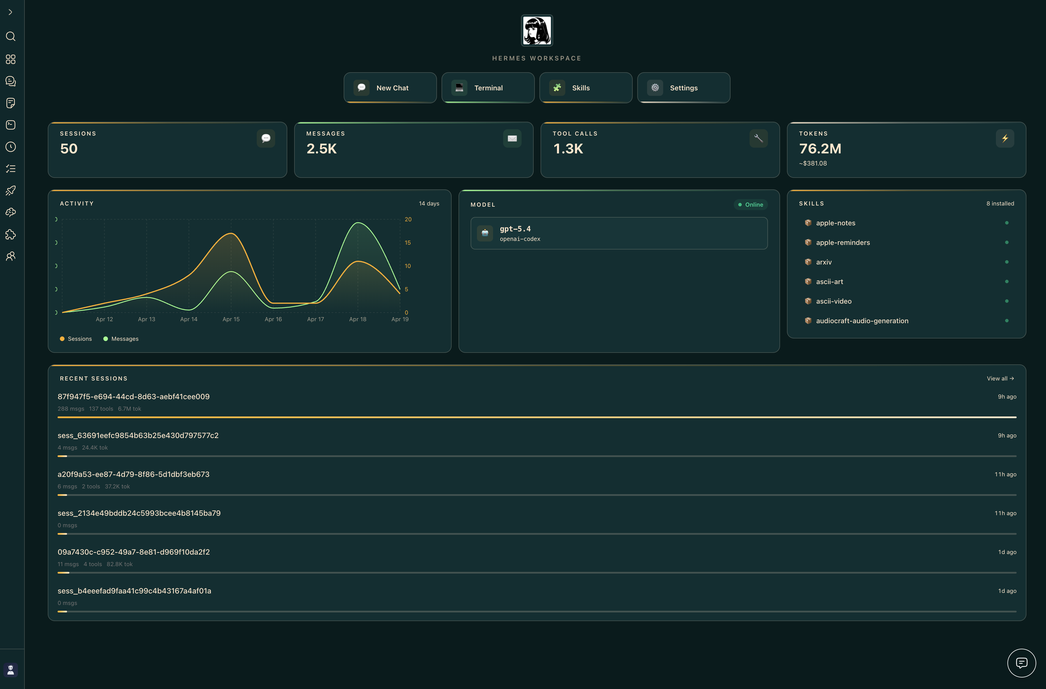
Cards and regions
Hero metrics
Four tiles across the top of the page, each showing a large number with an inline sparkline and a period-over-period percentage change:
- Sessions — total session count over the analytics window (default 30 days), with a sparkline of daily session counts and a delta vs. the prior half of the window.
- Tokens — total input + output tokens over the window, with a daily sparkline and period delta.
- API calls — total API calls (tool invocations) over the window.
- Active model — the currently configured model and provider, pulled from the gateway’s model info.
When the Hermes Agent’s analytics surface is available, tiles use analytics-sourced data. When it is unavailable, the tiles fall back to session-derived totals (counts only, no sparklines or deltas).
Attention marquee
A right-to-left scrolling strip that appears only when there are active incidents. Each item shows a severity color (warning, error, or info) and a source glyph:
| Source | Routes to |
|---|---|
| cron | /jobs |
| config | Settings |
| log / gateway | /jobs |
| platform | external link (if provided) |
Hovering the marquee pauses it so you can read longer messages. Clicking an item navigates to the relevant page. The strip is hidden when there are no incidents, so no empty row appears on a healthy system.
Ops strip
A single compact bar below the hero metrics that shows:
- Gateway state — a pulsing dot (green = running/connected/ok, amber = other), state label, and version number.
- Active runs — count of agents currently running.
- Last heartbeat — how long ago the gateway last reported a pulse.
- Config drift — a button appears if the local config version is behind the latest; clicking it opens the config diff.
- Platform pills — one pill per connected platform (e.g. Telegram, Slack) with a state color.
- Cron summary — total jobs, count paused, count running, and time to next scheduled run; clicking opens
/jobs.
The strip renders nothing if the gateway is unreachable, so the dashboard does not flash an empty frame on first load.
Analytics chart
A time-series area chart occupying the left two-thirds of the main grid. Plots daily sessions and tokens over the selected period. A period selector lets you switch between available analytics windows. AI-generated insights (from the aggregator) appear as annotations when present.
Analytics summary (Top Models)
A compact card in the right rail showing:
- Total tokens over the analytics window.
- Estimated cost (when the provider reports usage pricing).
- Top models ranked by token usage, each with a proportional bar.
This card hides itself when the analytics surface is unavailable or reports zero traffic.
Cost ledger
A per-model spend breakdown, hidden by default and accessible via Edit mode. It separates models into two groups:
- Paid — models billed by the provider, sorted by cost descending so the highest-spend models appear first.
- Included — subscription, local, or OAuth-authenticated models (e.g. Codex, Ollama, LM Studio). These show token volume instead of a dollar figure since they do not produce a real cost.
Cost figures require the provider to report usage pricing in API responses. Local providers typically do not, so their rows show tokens only.
Token mix and hour of day
A fused card in the right rail with two sections:
Token mix (top half) — a proportional bar breaking total tokens into four categories: cache read, input (prompt), output (completion), and reasoning tokens. Also shows the output-to-input ratio. Hidden when analytics is unavailable.
Hour of day (bottom half) — a 24-bar activity histogram built from session start times, showing which hours of the day are busiest. The peak hour is highlighted. Hidden when there are no sessions.
Logs tail
Opens as a modal (via a button in the dashboard). Fetches the last 200 lines from /api/dashboard/overview?logs=200 and refreshes every 3 seconds while the modal is open. A filter bar lets you narrow lines to all, errors, or warns. The header shows the log file name, total line count, error count, and warning count.
Sessions intelligence
A list of recent sessions (up to 200, polled every 30 seconds from /api/sessions). Each row shows:
- A derived human-readable title (falls back to a short slug from the session key).
- A kind icon (chat, cron, Telegram, etc.).
- Badges: hot (actively running), tool-heavy, high-token, error, stale.
- Model chip, message count, tool call count, token count, and recency.
The highest-priority session (hot > tool-heavy > most recent) gets a soft accent border so it stands out. Clicking a row navigates to /chat/<sessionKey>.
Edit mode
Click Edit mode in the dashboard header to open a persistent banner below the hero metrics. The banner lists every available widget grouped by column (Main / Side rail). Each widget has a toggle pill — active widgets are filled, hidden ones are outlined. You can show or hide any widget without losing data; the layout preference is saved in your browser’s local storage so it survives reloads. The banner also shows how many of the total widgets are currently visible.
When to use it
The Dashboard is useful for a daily health check: confirm the gateway is reachable, see whether costs are within expectations, spot sessions with errors or stale state, and verify cron jobs are firing on schedule. It is not a deep-dive tool — use the /jobs, /files, and individual chat pages for detailed inspection.
Data sources
All dashboard data originates from the Hermes Agent (default http://127.0.0.1:8642). The server-side aggregator (src/server/dashboard-aggregator.ts) fetches from the agent’s analytics API, status API, cron API, and log API, then assembles a single DashboardOverview payload served at /api/dashboard/overview. The client polls this endpoint via TanStack Query (30-second refetch interval for sessions; the overview query has its own interval). Sessions data is fetched separately from /api/sessions and is gated on the sessions gateway capability.
Common issues
- All cards show empty or loading indefinitely — the Hermes Agent is likely not reachable. Verify it is running and that
HERMES_API_URLpoints to the correct address. See Agent won’t connect. - Cost or token data is missing — the analytics surface requires the Hermes Agent to have analytics data for the window period. On a fresh install or after a restart, data accumulates over time. Some local providers (Ollama, LM Studio) do not report token usage to the gateway, so cost and token tiles may remain at zero.
- Attention marquee not visible — this is expected behavior when there are no active incidents. The strip is intentionally hidden when the incident list is empty.
- Config drift button appears in the Ops strip — your local config version is behind the latest version detected by the gateway. Click the button to review and apply the diff.